Invented by Sherman; William, Sherman IP, LLC
Today, we are going to explore a new patent application that introduces an innovative way to turn complex time-series input signals into clear, helpful visual displays. This technology is designed to help users quickly understand complicated data, like market trends or financial movements, by converting them into easy-to-read visual elements. In this article, we’ll guide you through the background and market context, review the scientific rationale and prior art, and then break down the core invention and its key features. We’ll keep everything simple, easy to follow, and useful for anyone interested in the future of data visualization and analytics.
Background and Market Context
In today’s world, the amount of data being generated is growing at a dizzying pace. Especially in finance, healthcare, and technology, data often comes as time-series information—think of stock prices, sensor readings, or even website traffic, all changing over time. Making sense of this kind of data isn’t easy. Most of the time, it’s filled with noise, sudden changes, and hidden trends. For people who need to make quick decisions, like investors or business leaders, it’s hard to spot what matters without help.
This is where data visualization steps in. Showing numbers as pictures—like graphs, dials, or color-coded labels—helps people see patterns right away. But there’s a challenge: raw time-series data isn’t always ready to be shown. It needs to be cleaned up, analyzed, and turned into something meaningful before it can be displayed. Many existing tools try to do this, but most fall short when facing really messy or unpredictable data. They might show a simple chart or a basic indicator, but they don’t go further in helping users understand what the data really means, especially when the data is unstable or behaves in unexpected ways.
Markets are demanding smarter visualization tools. Investors want dashboards that can tell them, at a glance, if the market is trending up or down, and what actions they might consider. Doctors need to see if a patient’s vital signs are improving or worsening, not just as raw numbers but as clear signals. Even in fields like transportation or social media, there’s a need to spot patterns, risks, or opportunities as soon as possible, with little room for error.
This new patent application answers that need. It offers a way to process raw input signals—especially those that are hard to predict—and turn them into rich visual displays that summarize trends, risks, and even suggestions for action. It does this by using a series of smart steps, including filtering, classifying, and mapping data into easy-to-understand elements like gauges, color codes, and dynamic dashboards. By doing so, it promises to make decision-making faster, easier, and more reliable, even when the data is complex or unstable.
Scientific Rationale and Prior Art
To appreciate how this invention stands out, it helps to understand the science behind signal processing and data visualization, as well as what’s already out there.
Time-series data is everywhere. In finance, it’s stock prices over time. In health, it’s heartbeats or temperature readings. In technology, it’s server loads and network activity. But these signals are often “nonstationary,” which means their patterns change over time and are hard to predict. Traditional methods like simple moving averages or basic trend lines can miss important shifts, especially when the data jumps around a lot.
Over the years, experts have developed many tools to handle time-series data. Moving averages smooth out the noise, momentum indicators show the speed of change, and autoregressive models try to forecast future values by learning from the past. Some systems use machine learning to spot patterns, while others create simple dashboards that update in real time. There are tools that color-code data points, show gauges or dials, and let users interact with the data. But most existing solutions are limited in a few ways:
First, they often require a lot of manual setup. Users need to pick which indicators to use, set thresholds, and decide how to display the data. If the data changes in an unexpected way, these tools can give misleading results.
Second, many tools are not flexible. They don’t adjust to new data on their own. If a market becomes more volatile, the thresholds used by the tool may no longer make sense, but the tool won’t know to adapt.
Third, many dashboards are static. They show a chart or a dial, but they don’t explain what’s going on or suggest what to do next. If a user isn’t an expert, they might not know how to read the display or what actions to take.
Finally, most tools don’t bring together all the best methods. Some use smoothing, some use classification, and some use visualization, but few combine these steps into one seamless process that goes from raw data to clear, actionable displays.
Previous patents and products have tried to tackle parts of the problem. For example, some systems use machine learning to classify financial signals as “bullish” or “bearish.” Others offer dashboards with color-coded alerts. There are also trading platforms that let users automate trades based on simple rules. But none of these solutions provide a full pipeline: taking raw, messy signals, cleaning them up, analyzing them with advanced models, mapping them to meaningful categories, and then showing the results in a clear, dynamic display that can even trigger actions automatically.
The scientific rationale behind this invention is to combine all these steps. By using momentum processing, autoregressive filtering, classification models, and dynamic visualization, the system can handle even the most unpredictable signals. It can adjust its thresholds based on recent data, learn from past results, and present everything in a way that’s easy for anyone to understand and use.
Invention Description and Key Innovations
Let’s dive into how this invention actually works and what makes it special.
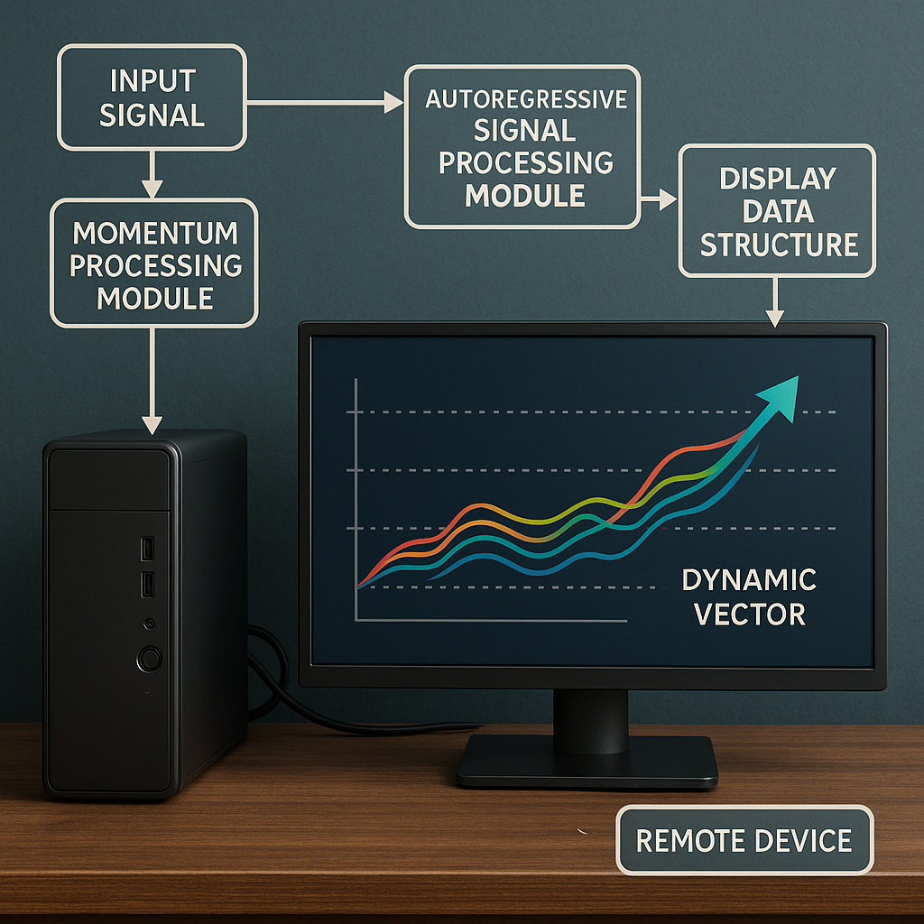
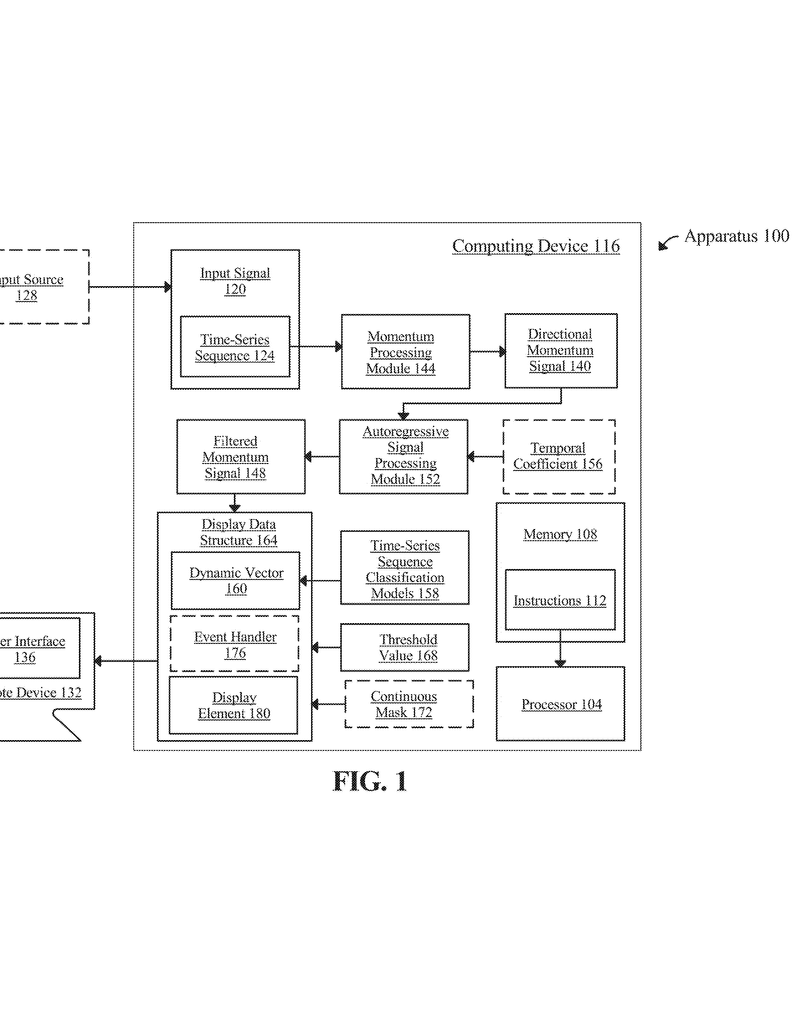
At its core, the system starts with an input signal. This could be any kind of time-series data—stock prices, sensor readings, or other values that change over time. The process is handled by a device with a processor and memory, which can be a computer, a server, or even a smartphone.
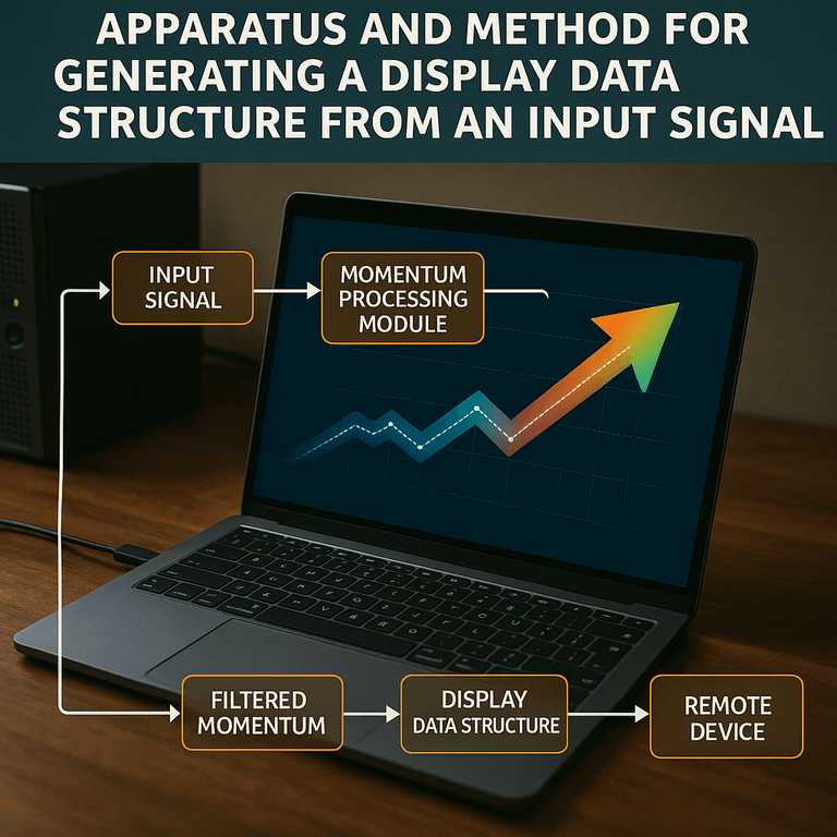
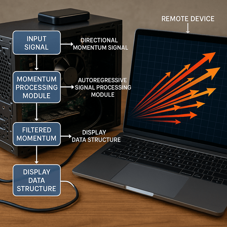
The first step is momentum processing. The system examines how fast and in what direction the data is changing. For example, in finance, it might use formulas like the Relative Strength Index (RSI) or other momentum indicators to see if a stock is gaining or losing speed. This step turns the raw data into a “directional momentum signal,” which is easier to analyze.
Next, the system applies an “autoregressive signal processing module.” This means it looks at the history of the momentum signal and uses mathematical filters—like moving averages or more advanced smoothing techniques—to clean up the noise and highlight the real trends. The output is a “filtered momentum signal,” which is much more stable and meaningful than the original data.
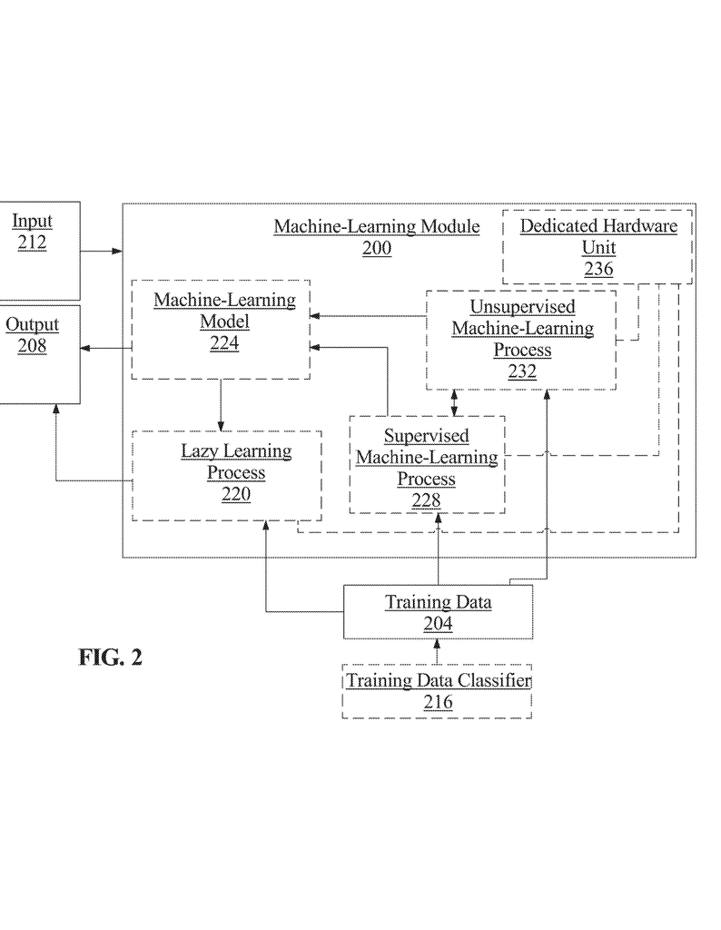
Now comes the smart part: classification. The system uses several trained models, which might be machine learning classifiers or other algorithms, to look at the filtered signal and decide what it means. For example, it can label the current state as “positive,” “neutral,” or “negative.” These models are trained on real-world data and can adjust to different markets, categories, or time frames. They can even take extra information into account, like news sentiment, related assets, or economic indicators.
The classified result is called a “dynamic vector.” This is a simple, clear label or score that summarizes the state of the system. For example, in investing, it might mean “bullish” (market going up), “bearish” (market going down), or “neutral.”
But the invention doesn’t stop there. The dynamic vector is then mapped to a “display data structure.” This is a special format that tells a remote device—like a user’s computer or smartphone—how to show the result. The display data structure can include many visual elements: dials, gauges, color-coded regions, charts, or even interactive components. For example, a gauge might point to green for “positive,” yellow for “neutral,” and red for “negative.” The system can display not just the current state, but also how long the state has lasted, recent changes, or even overlay threshold values on charts.
One of the key innovations is the use of “event handlers.” These are small pieces of code that can react to changes in the data. If the dynamic vector changes from “neutral” to “positive,” the event handler can update the display, change colors, or trigger new actions. For example, it can update a trading dashboard, send an alert, or even place a trade automatically by connecting to trading platforms through APIs. This makes the system not just a passive display, but an active assistant that can help users make decisions or take action right away.
Another important feature is the system’s ability to adapt. The thresholds and boundaries used for classification are not fixed. The system can look at recent volatility or changes in the data and adjust its thresholds so that it doesn’t give false alarms in a bumpy market, or miss signals in a calm one. It can also train its classification models over time, learning from user feedback or new data to get better and better at spotting what matters.
The invention is built to be flexible. It can handle one or many input signals, work with different categories (like different stocks, industries, or time frames), and present results in a way that matches what the user needs. It can show a single dashboard, or many displays side by side. It can record how long a certain state has lasted, highlight recent changes, or let users interact with the display to get more details.
The system is also designed for easy integration. The display data structures can be sent over networks to any device, and the visualization can include interactive elements, text, charts, or even animations. This makes it perfect for web dashboards, mobile apps, or embedded devices.
In practice, here’s how it might look: Imagine you’re an investor. You open your dashboard and see a dial pointing to green, with a label “Positive Market Sentiment.” The display also shows a chart of recent momentum, with threshold lines marking key levels. If the market shifts, the dial moves to yellow, and you get an alert. If you want, the system can even place a trade for you, following a strategy matched to the current market state. You don’t need to read raw data or guess what’s happening—the system does the heavy lifting and shows you what matters, right when you need it.
This invention is more than just a new kind of chart or dashboard. It’s a full toolkit for turning noisy, unpredictable signals into clear, actionable insights, all wrapped in a display that anyone can understand and use.
Conclusion
In summary, this new patent application introduces a smart, flexible way to process and display complex time-series signals. By combining momentum analysis, autoregressive filtering, machine learning classification, and dynamic visualization, it helps users quickly grasp what’s happening and decide what to do next. The invention stands out because it adapts to changing data, learns from feedback, and presents results in a clear, actionable way, making it valuable for finance, health, technology, and beyond. If you’re looking for a better way to make sense of complex data, this technology points the way forward.
Click here https://ppubs.uspto.gov/pubwebapp/ and search 20250218072.
