Invented by MILLER; Jacob Joseph Cameron, HU; Shana

Welcome! Today, we’re going to explore a new patent application about freeform content areas in interactive graphic design systems. If you are a designer, developer, or anyone curious about how design tools work behind the scenes, this article is written just for you. We’ll break everything down in simple words, so you can understand what this invention is about, why it matters, and how it stands out from what already exists.
Background and Market Context
Design software tools are everywhere now. They help people build websites, apps, and all sorts of digital products. Whether you use them to make a simple flyer, design a complex website, or create a new app, these tools are the backbone of digital creation. But as digital products become more complex, design tools also need to become smarter and easier to use.
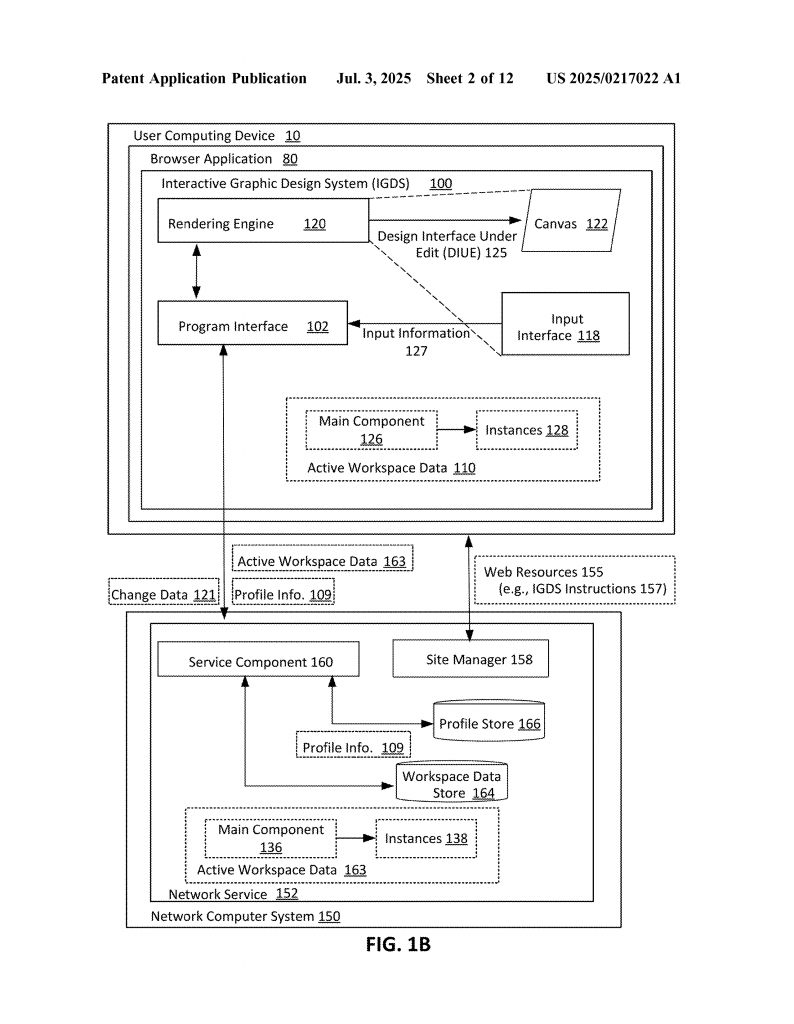
For many years, designers have faced a big challenge. When you make a template or a “component” (think of it as a reusable piece of a design, like a button or a card), you want to use it again and again across different parts of your project. Traditional design tools let you do this by creating a “main component” and then making “instances” of it. Every time you use that component in your design, you’re using an instance.
This is helpful because if you update the main component (say, you change the color of a button), all the instances update too. This keeps everything looking the same and saves lots of time. But what if you want to make a small change to just one instance? For example, maybe one particular button needs a different label or icon, but you don’t want to break the link to the main component because you still want to get future updates.
Here’s the problem: In most tools, if you change an instance, you have to “detach” it from the main component. That means it’s no longer connected, so any future changes to the main design won’t show up in your custom instance. As a result, designers end up with lots of disconnected pieces, which makes it hard to keep things consistent and up-to-date.
This is especially tough in big projects, like company websites or apps, where many people work together. If everyone starts detaching components, it quickly becomes hard to manage. There’s also the risk of mistakes, lost updates, or mismatched designs. Collaboration suffers, and teams spend more time fixing things than creating new ideas.

Now, there’s a big push in the market for design tools that let people customize components without breaking these links. Teams want flexibility without losing the benefits of shared, reusable components. Companies need to keep their brands and products looking the same across all their digital spaces, but they also want to allow for creativity and small tweaks where needed. This is where the new invention comes in—it aims to solve exactly this problem.
Scientific Rationale and Prior Art
To understand what’s new about this invention, let’s first talk about how current design tools work and what has already been tried before.
Most design tools today use a system of components and instances. You create the main version of a component, and then you use it in different places. Each use is called an instance. If you change the main one, all the instances update. But if you want to change something inside an instance—like add a special icon, move a text box, or change the color of one element—you usually have to detach that instance. After that, it doesn’t get updates from the main component anymore. This is called a “fixed hierarchy.” Every instance has the same structure and can’t be changed in a flexible way unless you break the connection.
Some tools have tried to solve this by letting users make some very limited changes, like changing the text or swapping an image. But these options are often set up in advance by the person who built the component. If you want to do anything different, you’re stuck. Other tools have tried to let you “slot in” some content, but this usually means you must follow strict rules and can’t add or move things freely.
In collaborative design tools, where many people work on the same project at the same time, the problem gets even harder. If one person detaches an instance to make a change, and someone else updates the main component, their work can get out of sync. Teams often have to spend extra time merging changes or fixing mistakes.
Some design systems use templates, layouts, or containers that allow for certain elements to be swapped in and out. For example, you might have a card design where you can change the image or the title, but you can’t add a new button or move things around unless you detach the component. There are also systems that suggest content or provide “preferred options,” but these are usually limited to things the original designer set up in advance.

What’s missing in all of these solutions is true flexibility. Designers want to freely add, remove, move, or change content inside a component without losing the connection to the main design. They also want to see suggestions for what to add, but not be forced to use them. And they want these changes to happen smoothly, even when working with others at the same time. None of the existing tools make all of this possible in a simple, seamless way.
This patent application introduces a better way. It describes a design system that creates “freeform content areas” inside components. These areas let users change things in any way they want—add new items, move things around, change colors or text—without breaking the link to the main component. The system suggests content, lets you set rules for size and layout, and works smoothly even when many people are working together. This is a big step forward from what’s been done before.
Invention Description and Key Innovations
Let’s dig into what this new patent application is all about. We’ll keep things simple and clear, so you can see the value and understand how it works.
The core idea is the use of “freeform content areas” in design components. Instead of locking every instance into a fixed structure, the system lets you create special areas inside a component where you can add, remove, or change content however you like. These freeform areas are like open spaces in your design—you decide what goes in them, how it looks, and how it works, all without breaking the connection to the main component. This means you get the best of both worlds: flexibility and consistency.
Here’s how the invention works:
1. Main Components and Instances with Freeform Content Areas
You start by creating a main component. This could be anything—a card, a button, a navigation bar, or any design element you want to reuse. Inside this component, you can set up one or more freeform content areas. These areas act as special containers where the content can be different in each instance.

When you use the component in your design, each instance gets its own version of the freeform area. You can add whatever you want into this space—text, images, shapes, even other components. The rest of the component stays connected to the main design, so if you update the main component, all the instances update too, except for the unique content inside the freeform areas.
2. Easy Customization Without Detaching
In this system, you don’t need to detach an instance to make changes. You just click into the freeform content area and start editing. You can add new items, move things around, or change properties like color, layout, or size. The system keeps track of these changes only for that instance, while everything else stays in sync with the main component. This keeps your design system strong and up-to-date, while letting you be creative where you need to be.
3. Smart Content Suggestions
The system helps you by suggesting content to add into the freeform areas. These suggestions can be based on what’s usually added, what is allowed by the component designer, or what is most relevant to your current design. For example, if the freeform area is meant for buttons, you might see suggestions for different button styles or actions. If it’s for text, you might see common text blocks or templates. But you’re not limited to these suggestions—you can add anything you want. This speeds up your workflow and helps keep things consistent, but never gets in your way.
4. Size and Layout Controls
When you add content to a freeform area, you can set rules for how big it should be, where it should go, and how it should behave when the component changes size. For example, you can set a button to always be 50 pixels wide, or to scale with the size of the container. You can anchor it to the left, right, top, bottom, or center. These controls help keep your designs looking good, no matter what content you add.
5. Real-Time Updates and Collaboration
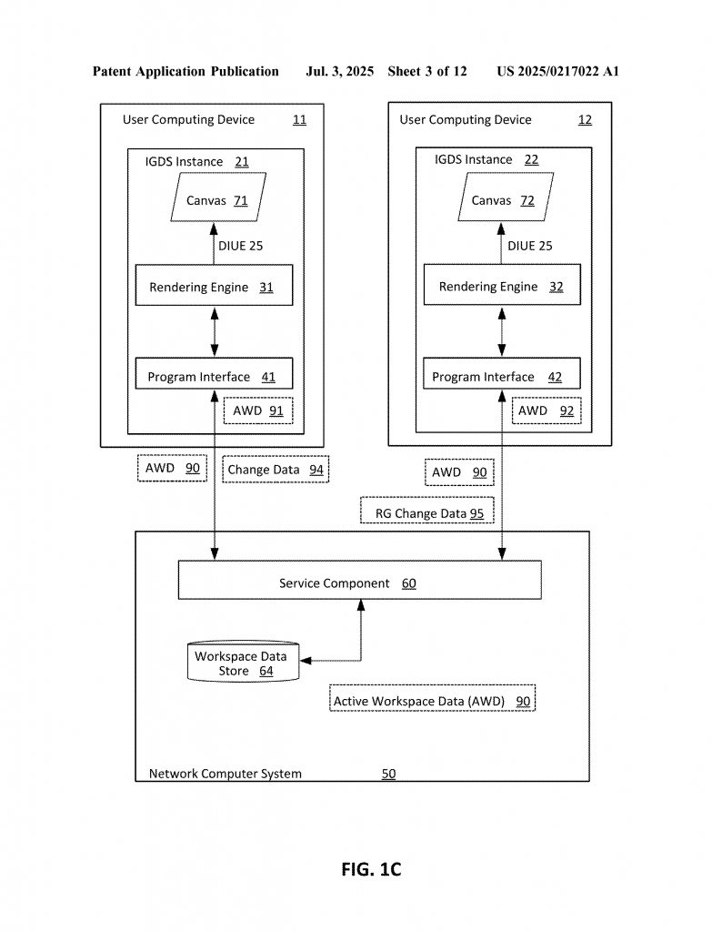
This design system is built for teams. If multiple people are working on the same project, everyone sees updates in real time. If you change a freeform area in one instance, others see those changes right away. If someone updates the main component, all the regular parts of each instance update too, but the unique freeform content stays the same. This makes collaboration smooth and prevents mistakes or lost work.
6. Works Across Devices and Platforms
The system is designed to work on all kinds of devices—desktops, laptops, tablets, and even smartphones. It can run in a web browser or as a native app. This means you can design wherever you are, using whatever device is most comfortable for you.
7. Simple, Flexible User Interface
The user interface is made to be easy for everyone. You can create a freeform content area by selecting parts of your component and using a simple menu or shortcut. You get clear visual cues about what areas are editable, and you can see at a glance which parts of your design are fixed and which can be changed. Everything updates in real time, so you always know what your design will look like.
8. Keeps Components Linked and Up-to-Date
One of the smartest parts of this system is how it keeps instances linked to the main component, even after you make changes in the freeform areas. If you go back and change the main component (maybe you update the style or fix a bug), all the instances update too. Only the unique parts inside the freeform areas stay the same. This means you never have to choose between customization and consistency—you get both.
9. Advanced Behind-the-Scenes Technology
Behind the user interface, the system uses a mix of smart code and real-time data syncing. It stores all your changes in a way that keeps them separate but connected. It uses fast graphics engines to draw your designs on the screen, so everything feels smooth and quick. And it can work with cloud services to keep your work safe and accessible from anywhere.
10. Broad Applications
This invention isn’t just for web or app design. It can be used to create presentations, whiteboards, art, code snippets, and more. Any place where you need both reusable components and flexible content, this system can help. It’s built to serve designers, developers, marketers, and anyone else who needs to make digital content fast and well.
Conclusion
This patent application introduces a simple but powerful way to make design tools better for everyone. By allowing freeform content areas inside components, designers and teams can customize their work without giving up consistency. The system keeps everything linked, up-to-date, and easy to use, even in big projects with many people working together. With smart content suggestions, real-time updates, and flexible layout controls, this invention could change how digital products are designed and built.
If you are looking for ways to make your design process smoother, more flexible, and more reliable, keep an eye on this technology. It’s a smart step forward in the world of interactive graphic design systems—and it could make your next project easier, faster, and more fun.
Click here https://ppubs.uspto.gov/pubwebapp/ and search 20250217022.
