Invented by Chauhan; Mayank, Cook; Travis, Smith; Patrick, Subedi; Mahesh
Forecasting is the backbone of smart business decisions, but most tools today are rigid and hard to adapt. A new patent application aims to fix this by allowing users to customize exactly how detailed their forecasts are, right down to the smallest data point. In this article, let’s break down the world behind this invention, explore how it stands apart from old methods, and see how it works in practice.
Background and Market Context
Every organization needs to look ahead. Whether you run a small shop or a global company, forecasting helps you plan for the future. Maybe you want to guess how many products you will sell next month, how much energy you will use, or even how many people will visit your website. Forecasts help with all these questions and more.
Today, most big businesses use software to make these guesses. They pull in data from sales, customers, and different parts of their business. These tools work well for simple setups. If you want to see how much a whole company will sell, or what one sales team might do, you can get an answer. But once you need more detail, things get tricky.
Let’s say you want to see not just total sales, but also sales by product, by region, or broken down by each salesperson. Maybe you want to drill down even further: see which products each salesperson is selling in each region. Most software tools don’t make this easy. They are usually fixed to show only certain views, like total account sales. If you want more detail, you might have to build a custom report, ask your IT team, or even use a completely different system. This takes time and can lead to mistakes.
The need for better, more flexible forecasting tools is growing. With more data available, and businesses becoming more complex, leaders want to slice and dice their numbers in new ways. They want to find out what’s really happening, not just at the top level but all the way down to the smallest detail. This is true for sales, energy use, cloud storage, and many other areas.
But until now, most software companies have offered only simple, one-size-fits-all forecasts. They might let you see account-level numbers, but not break things down by the many layers and relationships in your business. This leaves users frustrated and sometimes guessing, which can lead to missed targets or wasted money.
This is why customizable forecast granularity is such a big deal. It means you can set the exact level of detail you want. You can look at the big picture, zoom in on a team, drill down to a single product, or even see data for custom groups that make sense for your business. You don’t have to settle for what the software maker thinks is best — you set the rules.
The patent application we’re exploring today aims to fill this gap. It describes a way for users to pick and chain together different “modes” or views of their data, allowing detailed drill-downs with just a few clicks. Instead of being stuck with fixed reports, users can configure what they want to see, how deep they want to go, and get forecasts at every level.
This kind of flexibility is rare in existing tools. Most major platforms, like Salesforce, only forecast at the account level and don’t let users customize the layers below. The new approach in this patent could change the game, making forecasting more adaptable, useful, and accurate for all types of organizations.
Scientific Rationale and Prior Art
The science behind forecasting is all about using data from the past to predict what might happen next. This can involve simple math, complex statistics, or even machine learning. But no matter how smart the math is, the results are only as good as the data you use and how you organize it.
In the past, the main way to improve forecasts was to get better data or use new models. But another big factor is how you group and break down your data. If you can only look at the whole company, you might miss problems or chances at a lower level. If you can drill down to teams, products, or even single deals, you can spot trends and act faster.
Before this new invention, most software tools kept things simple. They would connect to your main data source, like a sales database, and show totals for accounts or teams. Some systems let you make custom reports, but these were usually hard to set up and often needed help from IT experts. Drill-down features might let you click from a company to a team, but the path was fixed and couldn’t be changed without major work.
A few platforms tried to offer more flexibility. For example, some business intelligence (BI) tools like Tableau or Power BI let users build custom dashboards. But even these tools usually require users to design each view or report by hand, and the drill-down paths are not easy to reconfigure on the fly.
Other tools focused on specific industries or data types, but they too were limited in how much users could customize the way they explored data. Most did not let users pick their own “chain” of relationships between data points. For example, you might be able to see sales by product, or by region, but not create a custom path like “sales by region, then by product, then by salesperson.”
The patent application we’re looking at adds something new: a way for users to set up their own chain of data relationships, linking different entities (like accounts, products, deals, or even custom data types) in whatever order makes sense for them. The system then uses this chain to pull in the right data, calculate forecasts at each level, and let the user drill down as deep as they want — all through a user-friendly interface.
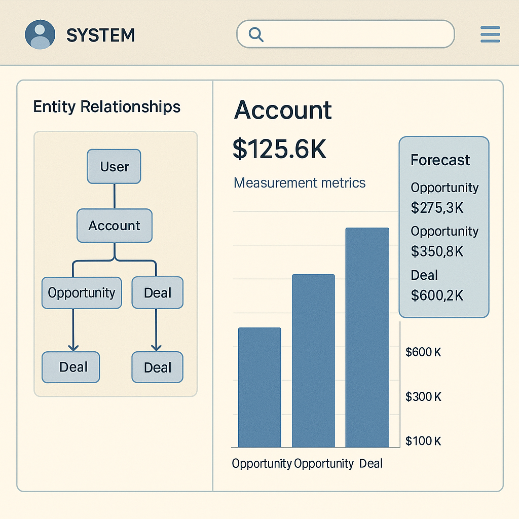
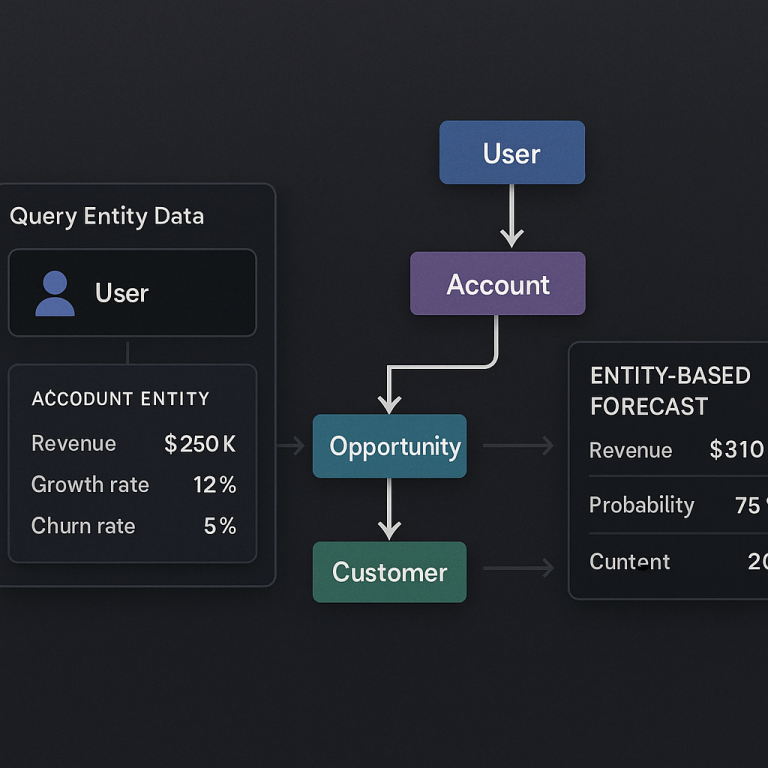
The “mode chaining” described in the patent is key. It means you can define a set of relationships, like account → opportunity → sub-opportunity, or even more layers. The system remembers these links, and when you click or tap in the software, it shows you the right level of detail, updates the forecasts, and lets you go deeper — as far as your data allows.
This is different from what came before. In older tools, the drill-down paths were fixed, and adding a new level meant asking developers to change the code or database. Here, users can set up and change their data chains themselves, using a simple configuration tool. They don’t need to know how to write code or build reports from scratch.
The system also works with different kinds of relationships. Sometimes you have a one-to-one link (like one account to one team), other times it’s one-to-many (one account to many opportunities). The invention handles both types, making sure users always see the right data at every level.
This approach is made possible by modern cloud computing, which allows software to fetch data from many sources, process it quickly, and update screens in real time. By connecting the dots between different data points and letting users pick their own paths, the system opens up new ways to explore, understand, and act on forecasts.
Invention Description and Key Innovations
Now let’s get into how this invention works and what makes it so special.
At its core, the invention is a method for configuring customizable forecast granularities. It’s built to help users see forecast values at different levels, and to make it easy to move from a big summary down to tiny details — all in the same interface.
Here’s how it works in practice:
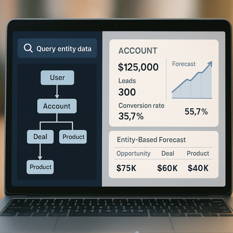
First, the system connects to your main data source, like a sales database or cloud usage log. It pulls in “entity data,” which just means the main things you want to forecast — these could be accounts, products, opportunities, or even custom objects unique to your business.
Next, the system shows a display panel in the software. This panel lists the main measurement metrics for your chosen entity — for example, sales targets, booked deals, or usage numbers. You see these at the top level, like total sales for an account.
But here’s where things get interesting. The user can define “mode chaining information.” This is a way to tell the system how your entities are related. You might say, “Each account has many opportunities, and each opportunity has many sub-opportunities.” You could also set up custom chains, like “region → product → salesperson.”
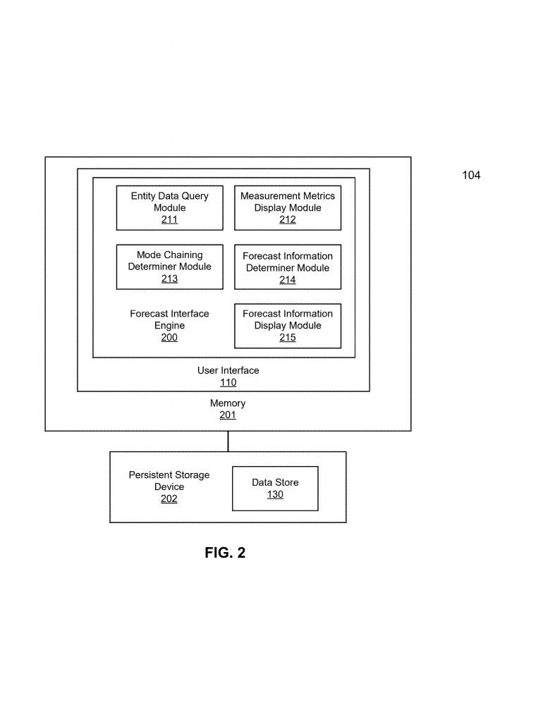
The system lets you set up these relationships using a configuration panel, often in a simple format like JSON or a visual tool. You can choose what each mode is (for example, an account, an opportunity, a custom object), how it links to the next mode, and what field to use for filtering or grouping (like account ID, product name, or region).
Once your chain is set up, the system figures out how to fetch and organize the data at each level. When you use the software, you see forecast values at the top level. If you want to drill down, you can click on any part of the display — like an account name — and the system will show you the next level, such as all the opportunities inside that account, with their own forecast numbers.
You can keep drilling down, following the chain you set up. At each level, the system updates the forecast values, shows the right measurement metrics, and makes it easy to see what’s going on. If you want to change the chain, you just update the configuration, and the system adapts right away.
The key innovations here are:
1. User-Defined Mode Chaining: Instead of fixed drill-down paths, users set up their own chains of relationships between entities. This means you can match the software to your real business structure, not the other way around.
2. Flexible Drill-Down in the UI: The interface lets users move from summary to detail with a click. Each level shows the right forecast numbers and metrics, all based on the chain you set up. You can go as deep as you want, and the system keeps everything in sync.
3. Real-Time Data Fetching and Filtering: As you drill down, the system fetches and filters the right data from your sources. It supports both one-to-one and one-to-many relationships, so no matter how your data is organized, you see the correct numbers.
4. Support for Custom Entities and Metrics: You’re not limited to standard things like accounts or deals. The system lets you use custom objects, new data fields, or whatever makes sense for your business. You can also set up custom metrics for forecasts, like sales, usage, or any other measurement.
5. Easy Configuration and Updates: The mode chaining is set up using a simple tool — no coding needed. If you want to change how your data is organized, you just update the configuration, and the system updates the drill-down paths and the forecasts automatically.
6. Aggregation and Roll-Ups: The system can sum up forecast values from lower levels to higher ones. For example, if you set forecasts for each salesperson, the system can add them up to show the total for a team or region. This helps you see both detail and the big picture without extra work.
7. Multiple Data Sources: The system can pull data from different places — maybe sales numbers from one database, usage stats from another. It keeps everything lined up, so your forecasts are always accurate and up to date.
All these features work together to make forecasting more flexible and useful. Instead of being stuck with fixed reports or needing IT help for every change, users can customize their own paths, drill down as deep as they need, and get forecasts that match their real business.
For example, a sales manager could set up a chain like “region → team → product → deal” and see forecasts at every level. If they want to add another layer, like “campaign,” they just update the configuration. The system fetches the right data, shows the new drill-down, and updates all the numbers.
This approach saves time, reduces errors, and lets people spot trends or problems faster. It also means you can adapt the software as your business changes. If you add new products or reorganize teams, you don’t have to wait for a developer to update your reports — you just tweak the configuration.
The invention is also designed to work on many types of devices, from desktops to tablets to phones. The interface is simple and clear, making it easy for anyone to use, not just data experts.
Finally, all this is possible thanks to a smart backend that handles data fetching, filtering, and aggregation. The patent covers not just the user interface but also the logic behind the scenes, making sure everything stays fast and accurate, no matter how complex your data is.
Conclusion
Customizable forecast granularities may sound technical, but the idea is simple: give users the power to see their data, their way. This new patent application shows a big leap forward, letting people set up their own drill-down paths, combine data from anywhere, and get forecasts at every level of detail they need.
By moving from fixed, rigid reports to flexible, user-driven tools, businesses can react faster, make better plans, and spot problems before they grow. This is a win for everyone — from busy sales managers to IT teams to company leaders. As more data pours in and businesses get more complex, tools like this will become not just nice to have, but essential.
If you’re tired of being stuck with one-size-fits-all forecasts, this new approach could be the answer. By putting the user in control, it opens up a world of possibilities, making forecasting smarter, faster, and more useful for every kind of organization.
Click here https://ppubs.uspto.gov/pubwebapp/ and search 20250217350.